
Building & Auditing an Agent-Ready WordPress Website
In our previous article, Is Your Website Design Ready for AI Agents?, we examined a new class of website visitor. Browser-based AI agents may do more than find and summarize content; they may also attempt to navigate websites, evaluate options, interact with controls, and complete tasks on behalf of a user.
That shift creates a practical development question. What does a WordPress website need in order to be genuinely understandable and operable by an AI agent?
The answer is not a mysterious protocol, an “AI-ready” plugin, or a new type of schema markup. Developers build an agent-ready WordPress website on familiar but frequently neglected principles: semantic HTML, recognizable controls, accessible forms, stable rendering, clear service architecture, and customer journeys that produce explicit outcomes.
Current browser agents may interpret a website through screenshots, raw HTML, the Document Object Model, and the browser’s accessibility tree. Therefore, the visual design, underlying structure, and interactive behavior must tell the same story.
A website does not become agent-ready by appealing to machines at the expense of people. Instead, agent readiness provides another test of whether the site is truly clear, stable, accessible, and technically dependable.
What Makes a WordPress Website Agent-Ready?
An agent-ready WordPress website exposes enough dependable information for an intelligent system to determine what the business offers, which actions are available, how those actions work, and whether the system completed a requested task successfully.
That requires more than crawlability. A crawler may discover a contact page and identify that it contains a form, while an agent attempting to complete an inquiry must understand the purpose of each field, identify the submission control, interpret any validation errors, and confirm that the website received the request.
The same distinction applies throughout the site. An agent may need to determine which service matches a user’s request, whether the business serves the user’s location, which call to action belongs to that service, and what should happen after the visitor activates the control.
You can therefore evaluate agent readiness across four basic questions:
- Can the system understand the page?
- Are the available actions clearly identified?
- Can the system operate the controls predictably?
- Will the system recognize a successful outcome?
When any of those stages remains ambiguous, the customer journey becomes vulnerable to failure.
Semantic HTML Before Visual Tricks
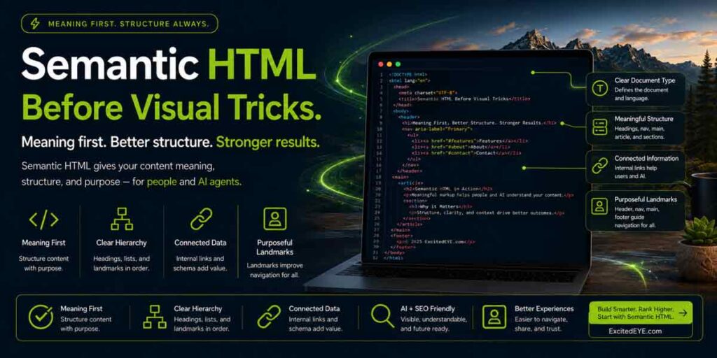 Modern WordPress tools can make nearly any element look interactive. A page builder can transform a generic container into a button, animate a block like a tab, or create an entire navigation system from deeply nested
 <div> elements.
The result may look polished, but appearance does not create semantic meaning.
Semantic HTML uses elements according to their purpose rather than their appearance. Navigation belongs inside a <nav> element, primary content belongs within <main>, actions should use <button>, destinations should use links, and developers should connect form fields to actual labels.
Native elements provide browsers with established information about how the page works. They also include expected keyboard, focus, and accessibility behavior that developers would otherwise need to recreate through custom JavaScript. MDN recommends using the correct semantic element for the intended job because native HTML supplies built-in accessibility support and predictable interaction patterns.
A Button Should Be a Button
A common WordPress problem occurs when developers style a generic element to resemble a button and then assign it a click event.
A person using a mouse may never notice the difference. However, the browser may still understand the object as a generic container rather than an interactive control.
Developers can add role="button", keyboard handlers, focus management, and accessibility attributes to a generic element. Nevertheless, adding a role does not automatically recreate the behavior of a native control. W3C guidance recommends using a native HTML element whenever it already supplies the required semantics and behavior.
This does not mean that WordPress interfaces must look generic. Developers can style a native button extensively without removing its underlying meaning.
The development order should be straightforward: establish the correct semantic element first, then create the visual presentation around it.
Heading Structure Must Describe the Page
Developers should not select heading tags simply because an <h2> looks larger or an <h4> happens to match the desired font size.
A logical heading hierarchy describes the organization of the content. The page begins with a clear primary topic, major sections sit beneath it, and supporting subsections follow in a predictable order.
When developers choose headings only for appearance, the resulting outline can become disjointed. A page may jump from an <h1> to an <h5>, use several competing <h1> elements, or mark decorative text as a major section heading.
CSS should control the size and appearance of headings. HTML should communicate their structural purpose.
ARIA Should Support HTML, Not Repair It
Accessible Rich Internet Applications attributes can add important names, roles, states, and relationships to complex interfaces. They are especially useful for custom widgets and dynamic content that standard HTML alone cannot adequately describe.
However, ARIA should not become a patch for avoidable markup problems. Adding an accessibility role to a generic element may announce its intended function, but the developer remains responsible for reproducing the keyboard behavior, focus handling, state changes, and other interactions users expect.
Native HTML should be the foundation. ARIA should supplement that foundation when the interface genuinely requires additional meaning.
Clear and Predictable Customer Journeys
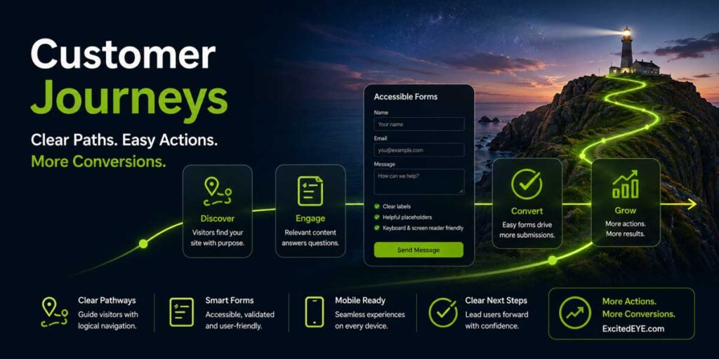
An agent-ready WordPress website should make every important customer journey easy to identify from beginning to end.
A visitor should be able to determine what actions are available, which service each action belongs to, what information is required, and what will happen after the action is completed. An agent attempting the same journey needs those relationships to be even more explicit.
Ambiguous calls to action create unnecessary uncertainty. A page containing six buttons labeled “Learn More” may make sense visually because each button appears beneath a different service card. Outside that visual context, however, the controls may be nearly indistinguishable.
 Clearer alternatives include:
- View WordPress Design Services
- Explore Webmaster Support Plans
- Request a Website Consultation
- Send My Project Details
- Review Technical SEO Services
The goal is not to make every button excessively long. Instead, each control should retain enough context to make its purpose understandable when interpreted independently.
Each Action Needs a Defined Scope
A button should clearly belong to the service, product, form, or interface component it controls.
Problems arise when a call to action appears visually near one service but is structurally placed outside that service’s container. A person may infer the relationship from spacing and design, while a system examining the DOM may encounter a less obvious connection.
Group cards, pricing modules, service descriptions, and related actions logically in the markup. That structure helps the browser and other systems understand which information belongs together.
The destination also needs to match the promise. A button labeled “Request a WordPress Consultation” should lead to a form or scheduling path designed for that purpose, not a generic contact page with no indication of what the visitor should do next.
Navigation Should Not Depend on Guesswork
Primary navigation should remain predictable across desktop and mobile experiences. Important service pages should be reachable through clear labels rather than clever wording, hidden gestures, or hover-dependent effects.
Hover interactions can complement a menu, but they should not be the only way to expose essential options. Touchscreen users, keyboard users, assistive technology, and automated systems may not reproduce the exact pointer behavior expected by the design.
Menus, drawers, accordions, and modal windows should also expose their current states. A browser should be able to detect each menu’s expanded state, each panel’s collapsed state, and the control that changes each state.
Visual animation can enhance those interactions, but it should not be the only signal explaining what occurred.
Every Journey Needs an Explicit Ending
A customer journey should not disappear after the final click.
After a visitor submits a form, the website should display a clear confirmation. For an appointment request, the website should tell the visitor whether it reserved the time or merely recorded a request. After a successful file upload, the interface should confirm the result.
A generic page refresh or disappearing button does not clearly communicate an outcome. Agents and human visitors both benefit from explicit messages that explain what happened and what comes next.
Accessible Forms and Explicit Feedback
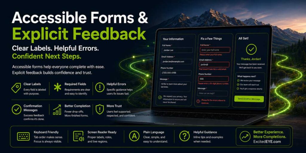
Forms are among the most commercially valuable parts of a business website. They are also among the easiest components to make structurally ambiguous.
A visually attractive form may still contain unlabeled fields, unclear requirements, inaccessible validation messages, or submission states that fail silently. These issues can prevent both people and automated systems from completing the journey.
Connect Labels to Their Fields
Every form control should have a label that accurately describes the information it requires. Programmatically associate the label with the field instead of positioning it nearby as unrelated visual text.
W3C guidance states that labels should describe the purpose of a control and be properly connected to it. MDN similarly recommends explicit for and id associations to improve compatibility with assistive technologies and external tools.
Placeholder text can provide an example, but it should not replace a persistent label. Once someone starts entering information, the placeholder may disappear, removing the only visible clue about the field’s purpose.
Labels should also use specific language. “Date” is ambiguous, while “Preferred Consultation Date” explains exactly what the field requests.
Identify Requirements Before Submission
Forms should clearly identify required and optional fields before a visitor attempts to submit them.
A small red asterisk may not provide enough information on its own. The meaning of the symbol may be unclear, and relying only on color creates an additional accessibility problem.
Use visible text and native attributes to identify required fields. When a format matters, explain it before the visitor makes a mistake.
 For example:
- Phone number, including area code
- Website address, beginning with
https:// - Preferred appointment date in month/day/year format
Clear instructions reduce errors instead of merely reacting to them.
Explain Errors Where They Occur
A message stating “There was a problem with your submission” does not identify the problem.
Effective validation should explain which field contains the error, what went wrong, and how to correct it. W3C guidance emphasizes that interfaces must alert users when an error occurs and help them determine what is wrong; its form guidance also recommends referencing the affected control and providing clear correction instructions.
Display errors near the affected fields and announce them appropriately when the form updates dynamically. The interface should not rely on color alone, and it should not erase every completed field because one item needs correction.
The objective is recovery, not punishment.
Confirm Successful Completion
After a successful submission, the website should clearly state that it received the request.
A good confirmation can include:
- What was submitted
- What happens next
- When the customer can expect a response
- How to correct or add information
- An alternative contact method for urgent needs
This message creates confidence for the customer and supplies a recognizable completion state for an agent.
Evaluate CAPTCHA and Anti-Spam Barriers
Spam protection is necessary, but some challenge systems create substantial usability barriers.
Image puzzles, timed challenges, or controls that depend on precise visual interpretation may prevent an agent from completing a form. They can also frustrate customers with disabilities or users on small mobile screens.
Whenever possible, use background risk detection, honeypot fields, rate limiting, server-side filtering, or other methods that reduce spam without interrupting legitimate visitors. When an interactive challenge remains necessary, provide an accessible alternative and preserve the visitor’s completed information if the challenge fails.
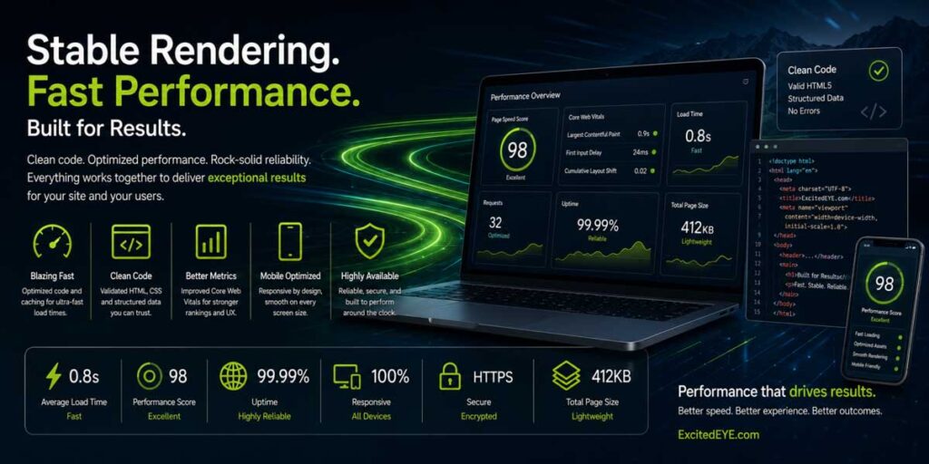
Stable, Lightweight Rendering
A website may have clear markup and still fail agent-readiness because its interface does not remain stable long enough to be used.
Agents that rely partly on screenshots can become confused when controls move after they examine the page. Web.dev’s agent-friendly guidance specifically recommends stable layouts and machine-readable accessibility hierarchies.
Layout stability also matters to people. A visitor may attempt to click a consultation button just as a late-loading banner pushes it down the page, causing an accidental selection.
Reserve Space for Images and Dynamic Content
Images, videos, advertisements, maps, and embedded widgets should have dimensions or aspect ratios that allow the browser to reserve space before the content finishes loading.
Without reserved space, each delayed asset can push surrounding content into a new position. Fonts, dynamically injected modules, and third-party widgets can create similar movement.
Web.dev identifies unknown media dimensions, font changes, and dynamically resized third-party content as common sources of cumulative layout shift.
A stable layout does not need to be static. Content can expand, collapse, or update in response to an intentional action, but the interface should connect each predictable change to that action.
Control Popups, Overlays, and Chat Widgets
Cookie notices, promotional modals, newsletter invitations, chat tools, and exit-intent popups can physically cover important controls.
Sometimes the problem is obvious. In other cases, a nearly transparent overlay remains positioned above the page and intercepts clicks even though the underlying button is visible.
 Every overlay needs:
- A clearly labeled close control
- Keyboard access
- Predictable focus behavior
- A mobile layout that does not cover the entire interface
- A stacking order that does not trap the visitor
- A method for returning to the original task
Test the website with multiple overlays active. A cookie banner, chat window, and promotional popup may work independently while becoming unusable when displayed together.
Reduce Dependence on Third-Party Scripts
WordPress websites often accumulate scripts from analytics platforms, advertising tools, chat providers, schedulers, review widgets, video embeds, social feeds, and plugin services.
Each script creates another external dependency. It may delay DOM construction, occupy the main browser thread, inject new content, or fail without warning.
Web.dev recommends auditing third-party JavaScript and loading nonessential scripts asynchronously when possible because synchronous third-party code can delay page construction and rendering.
The key customer journey should not require every tracker and marketing widget to load perfectly. Contact information, primary navigation, service content, and essential calls to action should remain available even when a noncritical third-party service fails.
Test the Website Before It Settles
Performance testing should examine the entire loading process, not only the final screenshot.
Watch what happens during the first several seconds:
- Do buttons appear before they work?
- After a font loads, does the navigation shift?
- Can a chat widget cover the mobile call to action?
- Does delayed JavaScript replace or reposition content?
- Will the primary form function when an analytics script fails?
- Does the page still make sense when optional scripts are blocked?
A website that works only after every dependency has finished loading is not resilient.
Clear Business and Service Identity
Connect an agent-ready website interface to an equally clear business identity.
An intelligent system may successfully operate the navigation but still choose the wrong customer journey if the website does not clearly define what the company does, where it operates, and which service matches the request.

Each strategically important service should have a dedicated page that explains:
- What the service provides
- Who provides it
- Who it is designed for
- Which problems it addresses
- Where it is available
- What evidence supports the company’s expertise
- Which action begins the engagement
Internal links, consistent business information, authorship, and accurate structured data can reinforce those visible facts.
Avoid Competing Service Definitions
WordPress websites often describe the same service differently across the homepage, navigation, service page, footer, and metadata.
One page may call an offer “web management,” another may use “website maintenance,” and a third may describe it as “webmaster services.” Those phrases can all be valid, but the relationship among them should be clear.
Choose one authoritative service page and connect related terminology back to it. The goal is not to eliminate natural language but to prevent the site from creating several disconnected versions of the same offer.
Connect the Service to the Provider
A service page should clearly identify the business responsible for delivering the work. It should also connect to relevant company information, team expertise, supporting articles, project examples, and local service details.
Structured data can reinforce these relationships, but it cannot replace them. Google’s current generative-AI guidance states that established SEO foundations remain relevant and that its generative search features do not require special AI files or unsupported markup.
The visible website, internal architecture, and machine-readable data should support the same account of the business.
Give Individual Pages Their Own Identity
Sitewide Organization, LocalBusiness, and WebSite schema can establish the broader company and domain. However, those entities do not automatically describe the specific purpose of every article or service page.
An individual blog post may also need a connected BlogPosting or Article entity, WebPage information, authorship, imagery, publication dates, and breadcrumbs. A service page may require a clear page identity and a relevant Service relationship.
A validator showing zero errors confirms that detected markup is technically valid. It does not necessarily confirm that the page defines every important entity.
How to Audit an Agent-Ready WordPress Website
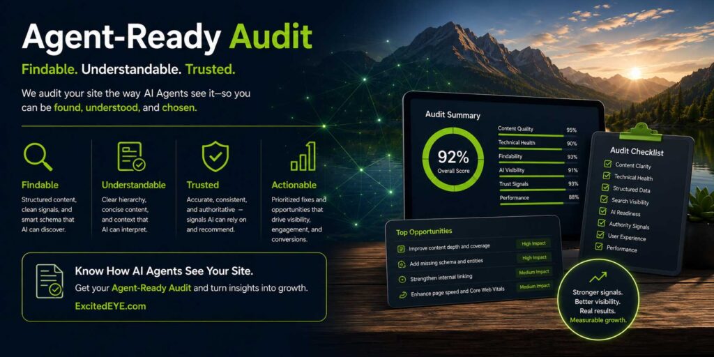
An agent-readiness audit should test genuine customer journeys rather than merely asking an AI tool to summarize the homepage.
The objective is to determine whether the site’s content, structure, controls, and outcomes remain clear throughout an entire task.
Navigation Audit
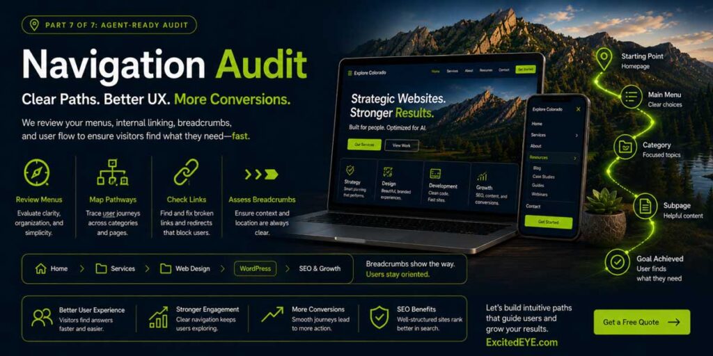
Begin with the routes customers use to reach important services.
Review the desktop navigation, mobile menu, breadcrumbs, contextual links, footer navigation, site search, and calls to action. Confirm that visitors can reach primary pages without relying exclusively on hover effects or unusual visual gestures.
Test whether:
- Menu controls expose clear names and states
- Keyboard users can open submenus
- Mobile navigation remains usable at different screen sizes
- Breadcrumbs reflect the actual site hierarchy
- Close and back controls are easy to identify
- Modal windows do not trap the visitor
- Visitors can reach important pages through more than one logical path
- The interface avoids dead ends
The audit should follow each route in both directions. Reaching a page is only half the journey; visitors must also be able to return, revise a choice, or move to a related service.
Interaction Audit
 Next, inspect every element that asks the visitor to do something.
This includes buttons, links, forms, tabs, accordions, sliders, modals, filters, search controls, booking tools, upload controls, and interactive cards.
For each Interactive Element, determine:
- Does it have the correct semantic role?
- Does it have a clear accessible name?
- Can it receive keyboard focus?
- Can a visitor activate it without a mouse?
- Is its current state available to the browser?
- Is it structurally connected to the correct content?
- Does activation produce the expected result?
- Will the interface communicate that result clearly?
Pay close attention to icon-only controls. A familiar “X” may visually suggest closing a window, but an unlabeled icon may not provide an accessible name explaining its purpose.
Performance and Stability Audit
Test the website under realistic and imperfect conditions.
Use a mobile connection, throttle the network, block individual third-party scripts, and watch the page while it loads. Review browser-console errors and examine whether the customer journey survives when an optional dependency is unavailable.
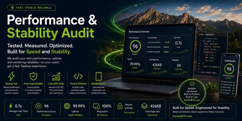 When conducting a Performance and Stability Audit, look for:
- Unexpected layout shifts
- Delayed or unresponsive controls
- Buttons that appear before becoming interactive
- JavaScript errors
- Failed embeds
- Duplicate event handlers
- Popups covering important actions
- Content injected above the current reading position
- Mobile-specific navigation failures
- Missing confirmation states
- Forms that fail without displaying an error
The objective is not to produce a perfect laboratory score. It is to identify anything that makes the website’s primary actions unstable or unpredictable.
Entity and Content Audit
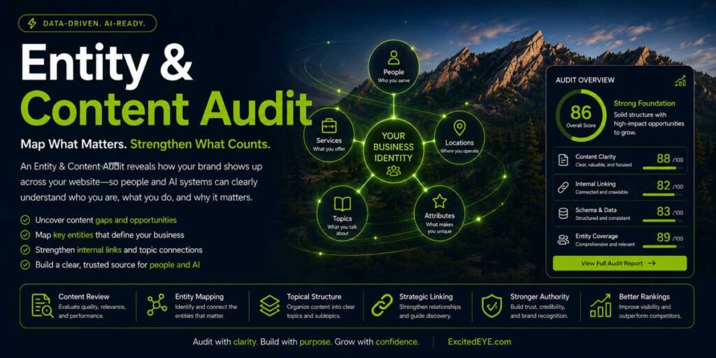 Finally, evaluate whether the website clearly defines the business and the purpose of each important page.
Confirm that your website pages have:
- The company name consistent across the site
- The physical location and service areas are accurate
- Major services have dedicated authoritative pages
- Service terminology is used consistently
- The content identifies authors and responsible people where appropriate
- Supporting articles link to relevant service pages
- Calls to action match the subject of the page
- Canonical URLs identify the intended version
- Page-specific schema describes the actual page
- Sitewide entities connect cleanly to page-level entities
This audit should compare visible content with the structured-data output. The two layers should reinforce each other rather than create separate or conflicting versions of the business.
Agent-Ready Is a Quality Standard, Not an AI Trick
Agent readiness should not become another label applied to routine SEO work or a reason to add more plugins to an already overloaded WordPress installation.
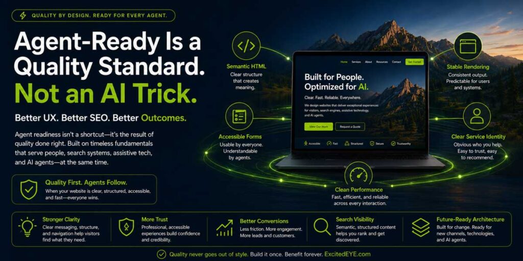 The strongest agent-ready website improvements reflect established indicators of quality:
- Semantic HTML improves structural clarity.
- Accessible controls improve operability.
- Clear labels reduce form errors.
- Stable rendering protects the customer journey.
- Lightweight code improves performance.
- Explicit service architecture strengthens understanding.
- Reliable confirmations increase confidence.
These improvements benefit human visitors, assistive technologies, browsers, crawlers, search systems, and emerging agents at the same time.
That is the larger opportunity. Businesses do not need one website for humans and another for machines; they need one well-engineered website whose meaning and functionality remain clear across multiple forms of interpretation.
The Technical Guardian Takeaway
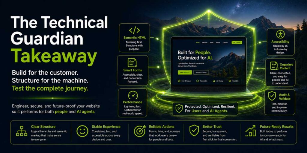
Activating a feature and declaring the project complete does not create an agent-ready WordPress website. It requires disciplined development across the entire website.
The HTML must define what each element is. The visual interface must reinforce those definitions. Forms must communicate what they require, identify errors, and confirm successful outcomes. Navigation must expose predictable pathways, while performance engineering keeps important controls stable and available.
The content architecture must also define the company, its people, services, locations, expertise, and customer actions. Structured data can reinforce those relationships, but it cannot compensate for unclear visible content or a broken interface.
Our first July article asked whether AI agents could understand and use your website. This second article establishes how to test the answer and where to look when they cannot.
ExcitedEYE Corp. helps businesses throughout Longmont, Boulder, Denver, and the Colorado Front Range engineer stronger WordPress websites through semantic architecture, code hygiene, structured data, accessibility, performance optimization, and focused customer journeys.
A future-ready, agent-ready WordPress website design should not merely attract the next visitor. It should clearly explain what that visitor can do and reliably support the entire journey from discovery through completion.
Build for the customer. Structure for the machine. Test the complete journey.
Leave a Reply
You must be logged in to post a comment.